Japandi-style homes are gaining popularity for their soothing aesthetics and functional elegance. If you’re looking to enhance your space with the best color palettes for Japandi-style homes, choosing the right hues is key to creating that tranquil yet stylish vibe. The perfect color combinations can transform any interior into a peaceful sanctuary while maintaining a modern and sophisticated look.
Why Japandi Color Palettes Matter?
Japandi design is a fusion of Japanese minimalism and Scandinavian functionality. The key lies in balancing warmth and simplicity, using colors that promote relaxation while staying visually appealing. Picking the right color palette ensures your home remains true to the Japandi essence. When selecting the best color palettes for Japandi-style homes, it’s important to focus on natural tones that blend seamlessly with minimalist interiors.
Top Japandi Color Palettes for a Harmonious Home
1. Earthy Neutrals: The Foundation of Japandi Aesthetics
A soft and neutral base is fundamental for any Japandi home. Think beige, off-white, soft taupe, and warm greys. These shades create an airy atmosphere while allowing furniture and textures to take center stage.
Suggested Palette:
- Warm Beige (#D8C3A5)
- Soft Taupe (#A89F91)
- Cloudy Grey (#CAC4B0)
2. Muted Greens for a Natural Touch
Japandi design embraces nature, and muted green tones reflect this beautifully. Subtle olive, sage, or eucalyptus hues bring a calming and refreshing feel to interiors.
Suggested Palette:
- Sage Green (#A7B7A3)
- Olive Green (#81866E)
- Eucalyptus Grey (#9C9F84)
3. Warm Earth Tones for Cozy Spaces
For a cozier ambiance, incorporate warm terracotta, burnt sienna, or deep ochre. These colors pair well with natural wood finishes and bring an inviting warmth to Japandi interiors.
Suggested Palette:
- Burnt Sienna (#E07A5F)
- Deep Ochre (#CC704B)
- Clay Brown (#8D6C5A)
4. Soft Pastels for a Subtle Touch
While Japandi homes tend to avoid bold, flashy colors, soft pastels like dusty pink, muted blue, or pale lavender can add a gentle personality without overwhelming the space.
Suggested Palette:
- Dusty Rose (#D4A5A5)
- Muted Blue (#A8C3D1)
- Pale Lavender (#C4B1C2)
5. Charcoal and Black for Contrast
To add depth and contrast, accents of charcoal or black work wonders. These colors are best used sparingly, such as in furniture, decor elements, or trim details.
Suggested Palette:
- Deep Charcoal (#4A4A4A)
- Matte Black (#2C2C2C)
- Ash Grey (#737373)
How to Incorporate These Palettes in Your Japandi Home?
Wall Colors & Finishes
Stick to soft neutrals for walls, adding subtle depth with limewash or textured paint. Feature walls in sage green or warm terracotta can serve as a stunning focal point without overpowering the space. Utilizing these wall colors is a great way to apply the best color palettes for Japandi-style homes.
Furniture & Textiles
Japandi furniture focuses on natural materials like wood, linen, and rattan. To bring in the color palette, opt for cushions, rugs, and upholstery in muted greens, warm earth tones, or soft pastels.
Decor & Accents
- Wooden or ceramic decor in earthy hues keeps things organic.
- Darker elements like black-framed mirrors or charcoal vases add contrast.
- Indoor plants complement the nature-inspired theme beautifully.

Final Thoughts: Choosing the Best Color Palettes for Japandi-style Homes
Selecting the best color palette for Japandi-style homes ensures a space that radiates calmness, warmth, and timeless elegance. Whether you lean towards earthy neutrals, muted greens, or soft pastels, the key is balance and simplicity.
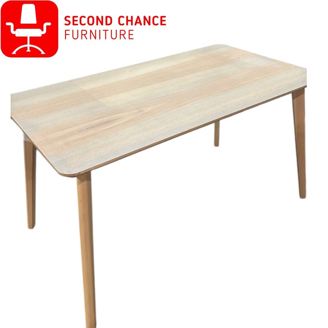
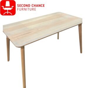
For high-quality furniture that perfectly complements Japandi aesthetics, check out Second Chance Furniture for a curated selection that enhances your home’s serene atmosphere.